End-to-End Data Analysis Project: Part 5. Data Exploration
Sonny Torres, Mon 20 May 2019, Python
Sonny Torres, Mon 20 May 2019, Python
Contents
I started this "End-to-End Data Analysis Project" in order to practice and document my programming skills with Python. Unlike many other blog posts, this series does not center around an easily acquired data set. In fact, all 4 blog posts preceding this one have covered just the gathering and formatting of the data [1]. Below is a recap of the previous 4 blog posts.
Again, the source code for each post can be found in my Github account.
Now, the data is one uniform file and is easy to manage. Below I will walk through some common data exploration techniques I use to understand a data set.
When exploring a data set I like to use an interpreter and interact with the data in real-time. I used the IPython command shell to develop the code for this post, and appropriately the code for this section is meant to be typed at a Python interpreter, otherwise you will have to use print([code]).
Below are the imports. I modified some visual settings for Pandas to view more output in the interpreter.
import matplotlib.pyplot as plt
from numpy import nan as NA
import pandas as pd
import numpy
import os

pd.set_option('display.max_rows', 500)
pd.set_option('display.max_columns', 500)
path = r'C:\Users\Username\Desktop\End-to-End-Data-Analysis\1. Get the Data\table'
file = 'CMBS New Final.csv'

df = pd.read_csv(os.path.join(path,file), encoding='ISO-8859-1')
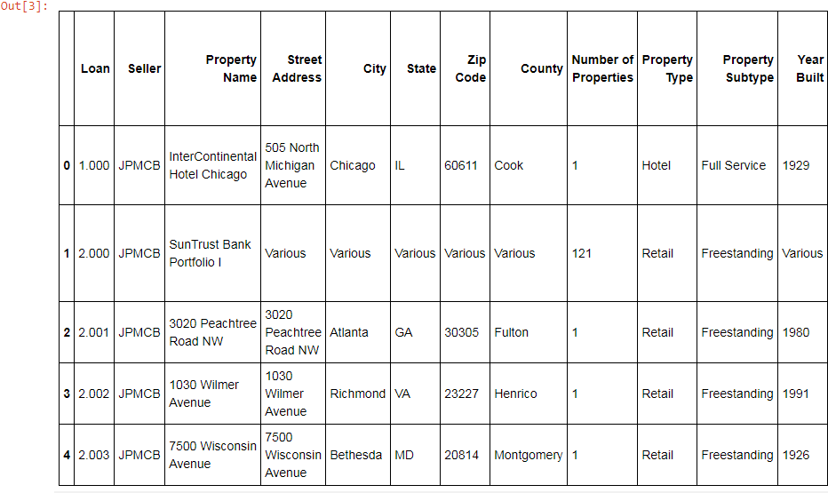
First, you can assess the general quality of the data by using the .head() method in a Python interpreter.
df.head()
Next, there are four fundamental characteristics I like to see for every data set.
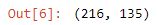
You can access the Pandas' .shape attribute and you will see a tuple containing the rows and columns in the format (rows, columns).
df.shape
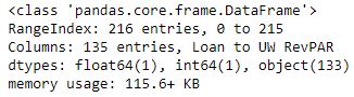
or you can call the df.info() method to get a little more information, such as memory usuage.
df.info()
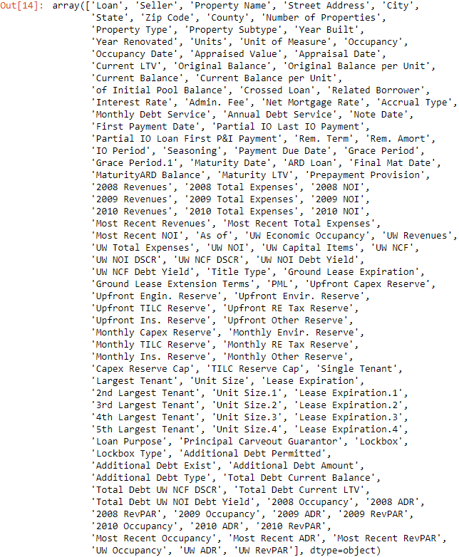
In my experience with working with Pandas, indexing by column names is one of the most common operations. For example, I may index column names to change a column's data type, combine columns, merge data sets, rename columns or produce aggregate statistics. Below is one way to see all of the columns for a data set.
df.columns.values
However, recently I have preferred to save all of the column names to a text file.
indx_cols = []
for tupl in enumerate(df.columns.values):
      indx, col = tupl
      indx_cols.append(str(indx) + ' ' + col)

np.savetxt("cmbs cols.txt", indx_cols, fmt="%s")
Above, the empty list indx_cols is the data container which will contain all of the column information.
I then iterated over each tuple that enumerate produces when passed df.columns.values.
The index values and column names are then appended to the list indx_cols.
np.savetxt then saves a text file with each column index number and column name, below.
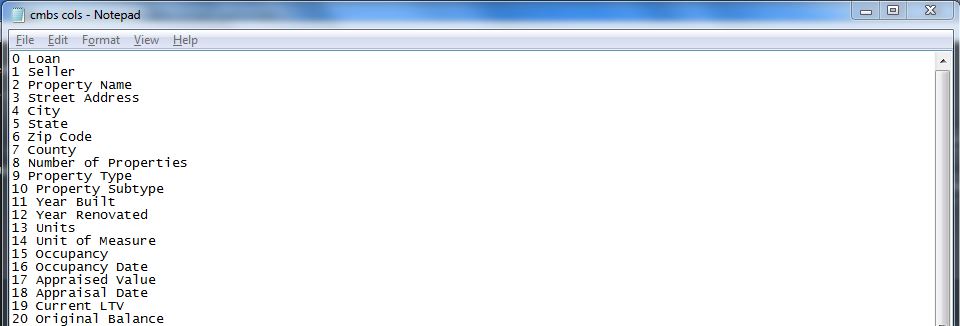
This way, you have a text file to refer to where you can highlight and copy/paste values when you are writing code that involves indexing long column names or, in this case, when there are 100+ columns to work with.
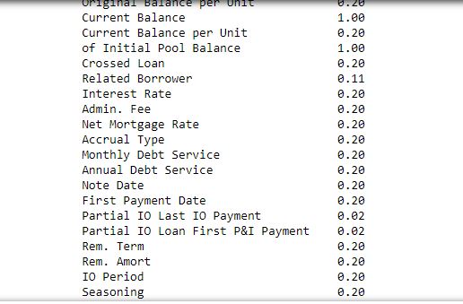
This particular data set has many null values and because I wanted to gather descriptive statistics on columns that consider each data point, it is useful to know how many data points and missing data points (null values) there are per column. For example, a median or average value for a given column of data is not so relevant when only 20% of the data is not null.
But first, I wanted to change the encoding (covered in this post) to make sure that the null values showed up at all. I was reminded that I needed to encode these values to UTF-8 when I saw that there were NO null values, which you can easily see is incorrect when opening the file in Excel. The null values were just read by Python (UTF-8 encoding) as string values that look like this: '\xa0 '. I could just replace these strange looking string values with NA values, but I prefer to convert to Python's native encoding to avoid any other issues.
Below will convert the the Windows-1252 or CP-1252 encoded data set into UTF-8 encoding, column by column. I used portions of code from a really cool blog written by Josh Devlin, on making Pandas Dataframes more memory efficient, which you can check out here.
str_dtypes = df.select_dtypes(include=['object'])
utf_encoded = str_dtypes.apply(lambda x: x.str.normalize('NFKD'), axis=1)
df.loc[:, [col for col in utf_encoded.columns]] = utf_encoded
df.replace('  ', NA, inplace=True)
First, in order to target just the columns with string values (in Python 'everything is an object', but this method is referring to strings with the keyword ''object'') and not the columns of numerical data types, I used the .select_dtypes Pandas dataframe method. I select only the string columns because using .apply on a Dataframe with a lambda function that is meant for only strings actually converts the numerical column to all null values.
Next, I used Pandas' .apply method and passed a lambda function where every x is a column that will have its .str. attribute accessed and the normalize method is used to convert the non-break space character into its correct character representation, a string value consisting of 3 spaces.
Because I want these non-break space characters to show up as blanks, or null values, I call df.replace so the string value ' ' is replaced with null values.
Now, I can call df.count() and see how many non-null values there are in each column. Or, rather than viewing the raw number of values that are valid values per row, you can view the percentage of values that are present in each column using the code below.
round(df.count() / df.shape[0], 2)
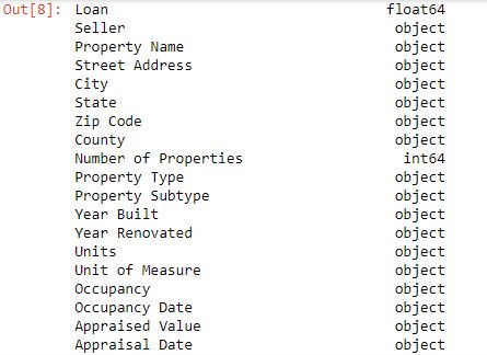
Below is a convenient way to see what each column's datatype is.
df.dtypes
and a thumbnail of the results from my Jupter Notebook, below.
Working with financial data, one of the most common datatype conversions I do is converting dollars and dates to usable, sortable data types. Below are two functions that I created to use for this purpose.
def currency(df, col):
      df[col] = df[col].replace("[$,()%]", "", regex=True).astype(float)

def date_convert(df, col):
      df[col] = pd.to_datetime(df[col], infer_datetime_format=True)
Notice that the currency function will not only replace dollar symbols, parentheses and commas with empty strings but also the percent symbol - another symbol often seen in business and finance [3]. See the documentation for Pandas' .replace method at this link and the pd.to_datetime documentation.
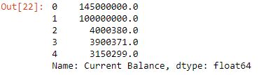
df['Current Balance'].head()
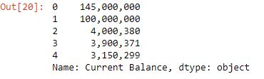
currency(df, 'Current Balance')
df['Current Balance'].head()
The date_convert function is just convenient shorthand for the Pandas' pd.to_datetime method. Surprisingly, the parameter and argument infer_datetime_format=True speeds up an otherwise lengthy conversion process (i.e. '5/26/2018' a string, is converted to 2018-05-26, a sortable date).
See the documentation for Pandas' .to_datetime method click here.
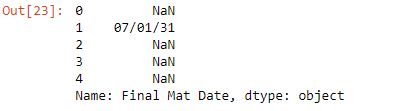
df['Final Mat Date'].head()
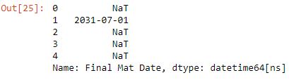
date_convert(df, 'Final Mat Date')
df['Final Mat Date'].head()
Another Metric I will look at is DSCR, Net Operating Income for a given period, divided by the total debt service due for that period.
df['UW NOI DSCR'] = df['UW NOI DSCR'].astype(float)
After assessing the basic characteristics of the data, I try to produce simple visualizations to gain a more intuitive understanding of the data. For example, a histogram representing a distribution of values for some category of data.
Matplotlib, Python's primary graphing library, has relatively low-level syntax compared to the main Python library. Creating a graph and customizing the graph can require many lines of code, each instructing a small change such as the color of a chart, formatting an axes to percent or rotating labels.
To make things more complicated, Matplotlib tutorials often look vastly different for similar operations. This is due to the fact that the library has two different interfaces. Data Scientist Jake Vanderplas artfully described how Matplotlib has a quick MATLAB-style interface and an object-oriented interface for more customizable graphs. I prefer to use the Object-Oriented interface.
The method of experimentation with Matplotlib that I found the most helpful was using the IPython shell coupled with its magic command %matplotlib, so that I could see the changes to the graph in real time as I tinkered with different presentation details. See the Magic Commands documentation.
Because it often took me many lines of code to produce a basic bar chart, I created a function with parameters that produces a customizable bar chart from a dictionary of data.
def cmbs_bars(dict_data, title, ylim_low, ylim_high, ylabel, y_thousands=True,
              text_message='', text_c1=0, text_c2=0, style='seaborn-bright',
              bar_color='darkblue', xtick_rotation=0, xtick_font='large',
              facecolor='lightgray', grid_line_style='-', grid_line_width='0.5',
              grid_color='gray'):

      data = sorted(dict_data.items(), key=lambda x: x[1], reverse=True)
      data_keys = [key[0] for key in data]
      data_index = range(len(data_keys))
      data_values = [value[1] for value in data]
      plt.style.use(style)
      fig = plt.figure()
      ax1 = fig.add_subplot(111)
      ax1.bar(data_index, data_values, align='center', color=bar_color)
      plt.xticks(data_index, data_keys, rotation=xtick_rotation,
                 fontsize=xtick_font)
      ax1.set_ylim(ylim_low, ylim_high)
      plt.ylabel(ylabel)
      plt.text(text_c1, text_c2, text_message)
      plt.title(title)
      ax1.set_facecolor(color=facecolor)
      ax1.grid()
      ax1.grid(linestyle=grid_line_style, linewidth=grid_line_width,
               color=grid_color)
      ax1.set_axisbelow(True)
      if y_thousands:
            ax1.get_yaxis().set_major_formatter(
                plt.FuncFormatter(
                    lambda x, loc: "{:,}".format(int(x))))
      plt.show()
Above, are the 24 lines of code that can be called to construct a bar chart from a dictionary of data. Does the function look extremely complicated and have a ridiculous amount of parameters? Yes, however only 5 of the parameters are required, and I would rather compromise with a cumbersome function with 5 required parameters, than have to write 24 lines of code with 800 characters to produce the graph I want. I summarized the matplotlib syntax and functions in the footnotes at the bottom of this post [4] but I will summarize what the function is doing below.
In short, unlike using the graphing tool in Excel where you can choose from a series of templates and drop-down menus, Matplotlib requires the user to use specific commands to construct a graph one basic characteristic at a time. For example:
Most of the remaining parameters in the function cmbs_bars() are for minor aesthetic changes to the graph. See documentation for function.
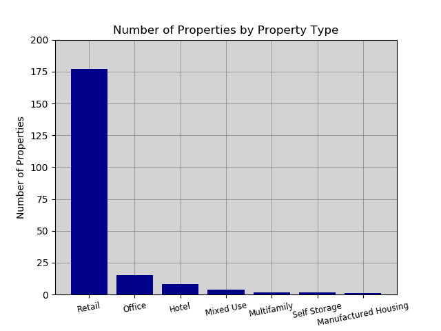
Below is a dictionary of property types that is then passed to the function cmbs_bars.
prop_dict = loans.groupby('Property Type')['Number of Properties'].sum().to_dict()
The simple use of the .groupby() method above represents a small fraction of the kind data filtering operations that are possible with Pandas' .groupby() method. More on the Group By Method in the Pandas Documentation.
And the dictionary values below:
{'Hotel': 9,
 'Manufactured Housing': 1,
 'Mixed Use': 5,
 'Multifamily': 2,
 'Office': 17,
 'Retail': 180,
 'Self Storage': 2}
Passing this dictionary to the function below...
cmbs_bars(dict_data=prop_dict, title='Number of Properties by Property Type', ylim_low=0,
          ylim_high=200, ylabel='Number of Properties', xtick_rotation=11, xtick_font=8.5)
produces the following graph...
There are of course other graphing libraries. Basemap is a graphing library that requires a given set of coordinates, 3 shapefiles and returns a geographic map with the coordinate data plotted on the map based on a given coordinate system.
Below is a graph I made some time ago with the Basemap library:
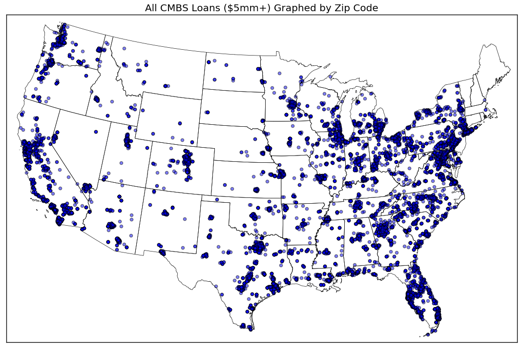
The map above is good example of how a large group of location data can be clearly presented in a way that highlights the underlying characteristic of the data, in this case - the disparity in the concentration of CMBS properties in various regions of the United States. Most notably, the northeast has a heavy concentration of CMBS propeties, as well as areas of Texas, California and Florida. There is far less CMBS exposure in states like North and South Dakota, Montana and Nebraska.
When merging different data sets or filtering a data set to work with a subset of the data, an important index or key I have learned to be aware of are a data set's unique row or record identifier. What column or columns uniquely, meaning the values do not repeat in any other row, demarcate a given row? For the CMBS data that I use, the key is actually two columns; "Deal ID" and the "Prospectus ID". When coupled or grouped together these two attributes distinguish every row from all the others. Three years ago, I thought writing complex INDEX/MATCH formulas in excel would suffice for what I wanted to do but as the data sets grew, so did the memory usuage and the time to write the formulas. Finally in 2017 I found Pandas' pd.merge method and it is the perfect tool for easily merging data sets. Below is a simplified summary of how I use this method in Python.
# df_left is the main data set
df_left = pd.read_csv(df1)

# df_right is a large data set that has some relevant information that you want joined to df_left.
df_right = pd.read_csv(df2)

# Because df_left is the main data set, the parameter 'how' is set to 'left'.
# Also, because df_left and df_right both have the 'Deal ID' and 'Loan Prospectus ID' columns in common, they can be joined on these columns.
df_merge = pd.merge(left=df_left, right=df_right, how='left', on=['Deal ID', 'Loan Prospectus ID'])
In the hypothetical example above, the two data sets are now merged. df_left would now have all the df_right data that had matching 'Deal ID' and 'Loan Prospectus ID' values to the values in df_left.
A single loan can be backed by multiple commercial properties. If a loan is backed by more than one property, the loan is listed first, followed by the properties that are the collateral for the loan. In order to extract information about the loans, a subset of the data which does not include property information for loans backed by more than one property, I created a simple but effective filtering mechanism using Pandas' string method .endswith() (documentation here). .endswith() does not accept a Regular Expression object, rather, it is used for simple match cases like the one below:
df['Loan Count'] = df['Loan'].astype(str)
loans = df.loc[df['Loan Count'].str.endswith('0'),:]
Now, any aggregate statistic such as a the sum of all values in a column, will reflect only the loan-level detail.
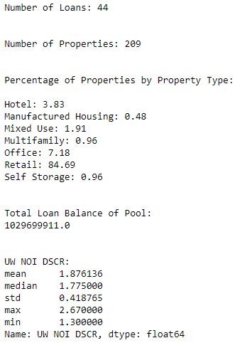
The dataframe loans contains all the information for the 44 loans in the pool but intentionally excludes property-level detail if there are more than one property. Below is a function I made to give an example of a function which accepts a dataframe and outputs fundamental statistics to describe the data. Basically, the function below cmbs_stats() is like the native Python function I used earlier, .describe(), the difference here being that cmbs_stats() contextualizes the data with instructions to produce domain related measurements and benchmarks such as risk and return variability and property type related information.
def cmbs_stats(df):
      num_loans = df.shape[0]
      num_props = df['Number of Properties'].sum()
      prop_type_count = df.groupby('Property Type')['Number of Properties'].sum()
      prop_dist = round((prop_type_count / num_props) * 100, 2).to_dict()
      dsc_describe = df['UW NOI DSCR'].agg(['mean', 'median', 'std', 'max', 'min'])
      print('\n')
      print("Number of Loans: {}".format(str(num_loans)))
      print('\n')
      print("Number of Properties: {}".format(str(num_props)))
      print('\n')
      print("Percentage of Properties by Property Type:\n")
      for key, value in prop_dist.items():
            print(key + ": " + str(value))
      print('\n')
      print("Total Loan Balance of Pool: \n{}".format(df['Current Balance'].sum()))
      print('\n')
      print("UW NOI DSCR: \n{}".format(dsc_describe))
cmbs_stats(df=loans)
I have learned so much in 2.5 years of computer coding with Python and I am barely scratching the surface of what is possible! I am excited to start learning Javascript next. Happy coding, everyone!
Again, please feel free to email me with any comments/questions: sonnycruztorres@gmail.com
Thanks!
| [1] | There is an axiom that states that 80% of a Data Scientist's time is spent acquiring, cleaning and preparing data. I believe this Forbes article and the survey cited in the article, is the main source of this propagated rule of thumb. I am not a Data Scientist and this is not a Machine Learning project but given my experience with working with data, the 80% rule seems plausible and in some cases, like this project, the data acquisition and cleaning stage is more like 90-95% of the entire project. It is clear to see that, after 4 blog posts and many lines of code, that acquiring, parsing and joining data can certainly consume the majority of your time when working on a data project. Data preparation is loathed by some and is sometimes, kind of pejoratively, referred to as "janitorial work" (not that there is anything wrong with janitors. I think humans are decades away from producing a robot that can adequately clean a public restroom). However, I have encountered some profoundly complex and thought provoking challenges when working through the aforementioned "janitorial" data preparation stage (my previous 4 blog posts in particular!) and I feel that I have become a better programmer and data analyst for solving these data preparation problems. |
| [2] | Is it worth creating a scraper in the real world? I guess it depends on the time it takes, the quantity and quality of the data and what it is used for. |
| [3] | For the curious, here is a cool article by Chaim Gluck from 2017, written for Towards Data Science, that measures the speed for different methods of converting financial data of type string to usable numbers like floats. |
| [4] |
|